
This advertisement was created for an amateur designer and published a web page called webneel.com witch a webpage where designer can share their work and fin inspiration
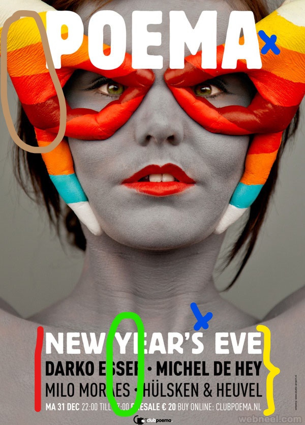
In red we have alignment: the paragraph is aligned centered but the designer did not choose that option randomly because that type of alignment fits very good.
In yellow we have the proximity: All the paragraph are related and that why the designer put them all together.
In green we have contrast: The white font contrast very well with the dark background; the black two lines also make a good contrast.
In blue a marked the repetition items: The title “poema” and the first line of the paragraph “new year’s eve” have the same font family witch gives a very consistence to the image
Up in brown we have the colors: The designer did a good choose of the palette of color following the color wheel; and also create a good contrast using cool colors for the woman and background and then using warn color in the hands to create and amazing visual effect
The four principals of design and the theory of color were implemented very well in the image. The designer created very contrast image in witch the people get engage and gave it a very consistence design
